
You live in a world where mobile devices drive how people interact with the web. Over 61% of global website traffic now comes from mobile devices. If your site fails to deliver a smooth mobile experience, you risk losing visitors and sales.
About 40% of users leave a site that is not mobile-friendly.
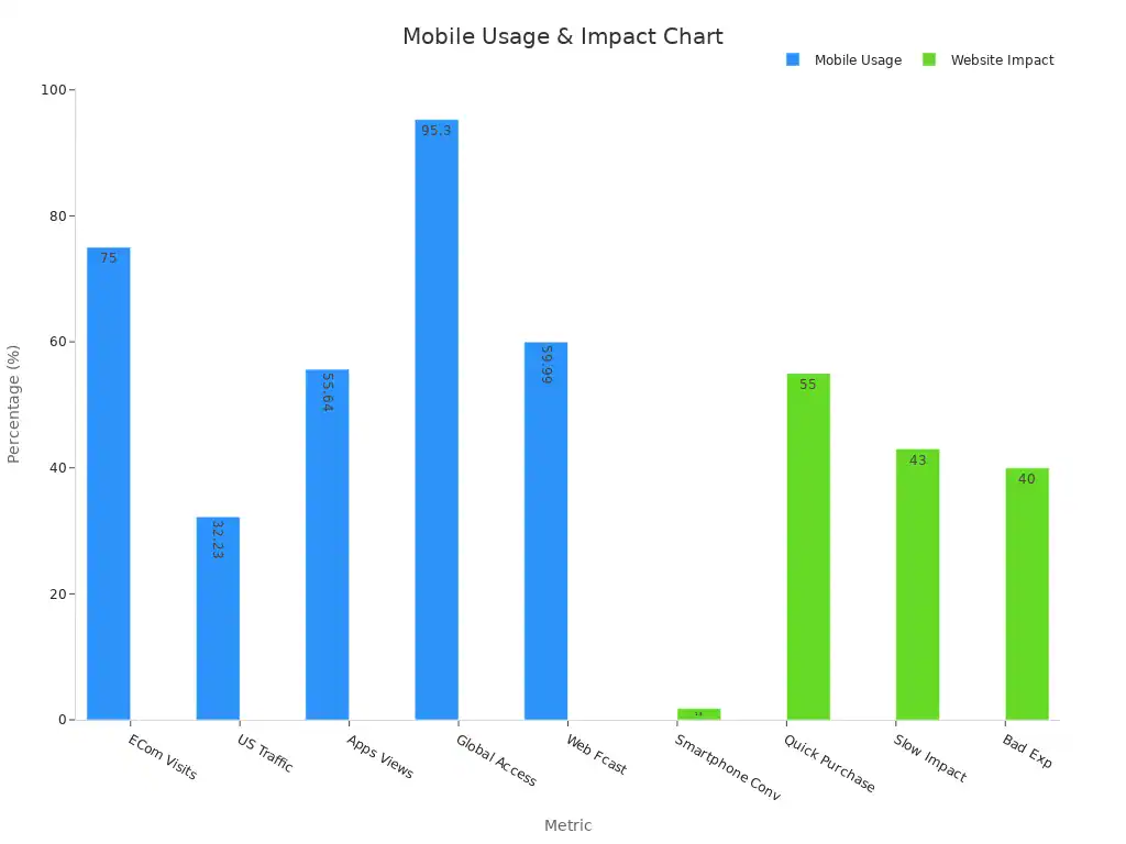
76% of adults in the US make purchases using smartphones.
Responsive websites see up to 20% higher user engagement.
Mobile Website Design helps you reach your audience, improve user experience, and boost your business growth.
Key Takeaways
Mobile devices drive over 60% of web traffic, so a mobile-friendly site helps you reach more users and grow your business.
Fast, easy-to-use mobile websites keep visitors engaged, reduce bounce rates, and increase the chances they will return.
Google ranks sites higher when they load quickly and work well on mobile, improving your visibility and attracting more visitors.
Simple navigation, clear buttons, and responsive design boost user satisfaction and can increase sales and conversions.
Regularly test and update your mobile site to fix issues, improve speed, and provide a smooth experience for all users.
Why Mobile Website Design Matters

Mobile Usage Trends
You live in a time when mobile devices shape how people use the internet. Mobile traffic now makes up over 62% of global web visits, and this number keeps rising. In many countries, such as Nigeria and India, more than 80% of web traffic comes from mobile devices. Even in the United States, nearly half of all web visits happen on mobile.
People of all ages use smartphones to shop, read news, and connect with others. Over 56% of internet users aged 16 and up shop online every week, and most of them use mobile devices. In 2024, global ecommerce spending reached $4.12 trillion, showing how important mobile access has become for business growth. If your website does not work well on mobile, you risk missing out on this huge audience.
Tip: Mobile website design helps you reach users where they spend most of their online time.
User Experience
A good mobile website design makes your site easy to use and keeps visitors coming back. When your site loads quickly and looks great on any screen, people stay longer and interact more. Studies show that reducing page load time by just 2.5 seconds can boost engagement rates by 14%. Responsive design can increase mobile traffic by 32%. If you improve speed and navigation, you can cut bounce rates by 25%, which means more visitors stay and explore your site.
Metric | Improvement/Value | Impact on Mobile Visitor Retention |
|---|---|---|
Engagement Rates | 14% increase after reducing page load by 2.5 seconds | Faster load times lead to higher engagement and retention |
Bounce Rates | 25% reduction after improving speed and navigation | Lower bounce rates indicate visitors stay longer |
Mobile Traffic | 32% increase after implementing responsive design | More visitors due to mobile-friendly design |
If your site is hard to use on a phone, people leave fast. In fact, 88% of users say they will not return after a bad mobile experience. On the other hand, 74% are likely to return if the mobile experience is good. Clear menus, easy-to-read text, and buttons that are simple to tap all help create a positive experience.
SEO Impact
Search engines like Google now use mobile-first indexing. This means Google looks at your mobile site first when deciding how to rank your pages. If your mobile website design is slow or hard to use, your search rankings can drop. Fast load times, responsive layouts, and touch-friendly buttons all help your site perform better in search results.
Improving your site’s speed by optimizing images and reducing scripts makes your site more responsive. Google rewards these changes with higher rankings. Clear navigation and a strong content structure help both users and search engines find what they need. Local businesses also benefit, as 57% of local searches come from mobile devices. When your site works well on mobile, you show up more often in local search results and maps.
Metric | Good Performance Threshold | Average Performance Threshold | Poor Performance Threshold |
|---|---|---|---|
First Contentful Paint | Under 1.8 seconds | 1.8 to 3 seconds | Over 3 seconds |
Largest Contentful Paint | Under 2.5 seconds | 2.5 to 4 seconds | Over 4 seconds |
Total Blocking Time | Under 200 milliseconds | 200 to 600 milliseconds | Over 600 milliseconds |
Cumulative Layout Shift | Under 0.10 | 0.10 to 0.25 | Over 0.25 |
Note: Meeting these performance goals helps your site rank higher and keeps users happy.
Conversions
Mobile website design directly affects your sales and leads. If your site loads in two seconds or less, you can see a 15% higher conversion rate. Every extra second of delay can drop conversions by up to 20%. Over 70% of mobile users will abandon their shopping carts if the checkout process is not easy on their phones.
Statistic Description | Conversion Rate Impact | Source |
|---|---|---|
Websites loading in 2 seconds or less have 15% higher mobile conversion rates | +15% conversion rate | Landingi |
Each 1-second delay in mobile page load can reduce conversions by up to 20% | -20% conversion rate per second delay | Think with Google |
Load times between 0-4 seconds correlate with highest conversion rates | Highest conversion rates | HubSpot |
Simple forms, clear calls-to-action, and touch-friendly buttons make it easier for users to complete purchases or sign up for services. Tracking tools like heat maps and A/B testing help you see what works best, so you can keep improving your site and boosting conversions.
🚀 A fast, user-friendly mobile website design turns visitors into customers and helps your business grow.
Mobile-Friendly vs. Mobile-First
Mobile-Friendly Design
You make your website mobile-friendly when you adapt an existing desktop site so it works on smartphones and tablets. This approach ensures your site displays correctly on smaller screens. You might use responsive layouts, larger buttons, and readable fonts. Many businesses start with a desktop design and then adjust it for mobile users.
Tip: Focus on clear icons, simple menus, and large tap targets to help users navigate easily.
A mobile-friendly site improves your search rankings and keeps users from leaving due to poor usability. For example, if your site loads quickly and looks good on any device, you can reduce bounce rates and increase engagement. Industry benchmarks suggest you should:
Use familiar icons for navigation.
Limit text and highlight visuals.
Remove non-essential elements.
Optimize speed by compressing images and streamlining code.
Mobile-First Approach
A mobile-first approach means you design your website for mobile devices before anything else. You start with the smallest screen and build up, making sure every feature works well on a phone. This method puts mobile users at the center of your design process.
Mobile-first design leads to better user engagement. Users spend more time on your site, bounce rates drop, and conversions go up. For example, companies like Walmart and AliExpress saw higher conversion rates and more orders after improving their mobile sites. Mobile-first design also helps your site load faster, which keeps users happy and boosts your SEO.
You should:
Make navigation easy with hamburger menus or bottom bars.
Optimize performance by compressing images and minifying code.
Ensure accessibility with high-contrast colors and alt text.
Key Differences
Aspect | Mobile-Friendly Design | Mobile-First Approach |
|---|---|---|
Design Process | Adapts desktop site for mobile | Starts with mobile, then scales up |
User Experience | Good, but may miss mobile-specific needs | Excellent, optimized for mobile users |
Performance | Improved, but sometimes slower than mobile-first | Fastest load times, lower bounce rates |
SEO Impact | Ranks higher than non-mobile sites | Best for Google’s mobile-first indexing |
Engagement & Conversions | Increased, but not as high as mobile-first | Highest engagement and conversion rates |
📊 Over 60% of global internet users access the web on mobile devices. A mobile-first strategy helps you reach this audience and grow your business.
Mobile Website Design Best Practices
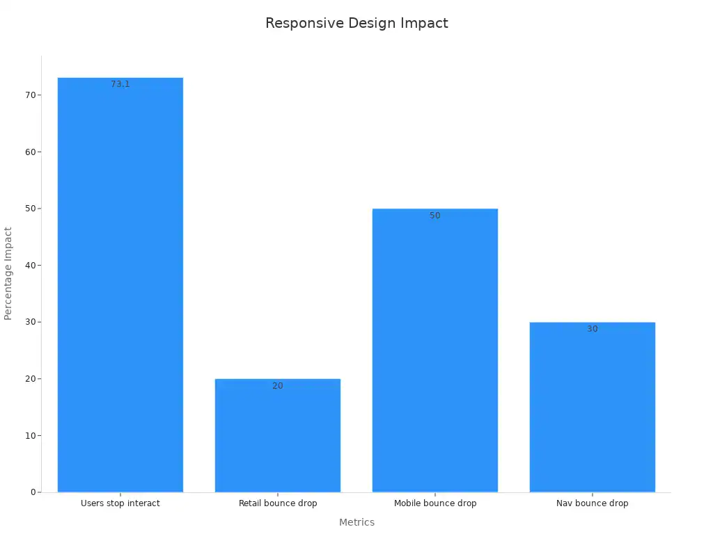
Responsive Design
Responsive design helps your website look great on any device. You want your site to adjust smoothly to different screen sizes. When you use a responsive layout, users stay longer and bounce rates drop. For example, bounce rates can fall by up to 50% on mobile-friendly sites. The table below shows how responsive design improves user engagement:
Metric Description | Reported Impact |
|---|---|
Percentage of users who stop interacting due to lack of responsiveness | 73.1% |
Bounce rate decrease after implementing responsive design on a retail site | 20% |
Bounce rate reduction among mobile users on responsive sites | 50% lower |
Bounce rate reduction due to mobile-friendly navigation | 30% |
Tip: Always test your site on different devices to make sure it stays easy to use.
Navigation
Clear navigation helps users find what they need fast. If your menus are confusing, people leave your site. Research shows that 88% of users do not return after a bad navigation experience. Good navigation can boost conversion rates by up to 400%. You should use simple menus, clear icons, and keep important links easy to reach.
High bounce rates often mean users cannot find what they want.
Short time on page may show users struggle with navigation.
Tracking user paths helps you spot where people get stuck.
UX Improvement | Documented Conversion Rate Increase |
|---|---|
5-10% increase | |
Streamlined Checkout Process | 10-15% increase |
Optimized Forms | 5-12% increase |
One-Click Purchasing | 8-12% increase |
PWA Implementation | 15-25% increase |
Speed Optimization
Fast load times keep users happy. If your site loads slowly, people leave. A retail site that cut load time from 9 seconds to 3 seconds saw a 30% jump in leads. You can boost speed by compressing images, reducing scripts, and using caching. These steps lower bounce rates and help users stay longer.
Compress images for faster loading.
Minimize code and scripts.
Use a content delivery network (CDN).
🚀 Fast sites lead to more conversions and better engagement.
Visual Clarity
Simple and clear design keeps users focused. When you improve visual clarity, user retention can rise from 20% to 50%. Use large fonts, high contrast, and enough spacing. Make sure buttons stand out and avoid clutter. A clean layout helps users read and interact with your site.
Metric | Before Improvement | After Improvement | Description |
|---|---|---|---|
User Retention Rate | 20% | 50% | Retention rate on mobile web platform increased after UI redesign and SSO integration. |
Week-over-Week Active User Rate | N/A | +40% | Active user engagement rose due to frictionless authentication. |
Average Weekly Queries per User | N/A | +200% | Higher engagement after improving visual clarity. |
Accessibility
Accessible websites welcome everyone. Over 96% of top sites are not accessible, leaving out many users. You should add alt text to images, use high-contrast colors, and make sure your site works with screen readers. Accessible sites reach more people and can even boost your market performance by 50%. Many users will pay more for products from accessible sites.
Fix low contrast and missing alt text.
Make buttons large and easy to tap.
Follow WCAG guidelines for better inclusiveness.
Content Structure
Good content structure makes your site easy to read. Break text into short paragraphs. Use subheadings and bullet points. Place important content at the top. Add visuals to support your message. Design for thumb-friendly use so users can tap buttons easily.
Use short paragraphs for easy reading.
Add subheadings and bullet points to organize information.
Place key actions within thumb reach.
Compress images to speed up loading.
Test your site on different devices for a smooth experience.
Note: Avoid tiny fonts, crowded layouts, and hidden menus. These mistakes make your site hard to use.
Technical Essentials
HTML5 & CSS3
You build a strong foundation for your website by using HTML5 and CSS3. These tools help you create pages that load fast and look great on any device. Start with a solid HTML structure. Use semantic elements like <header>, <footer>, <article>, and <section> to make your site easier to read and navigate. This also helps search engines understand your content.
Follow W3C web standards to keep your site accessible and secure. Use CSS3 for responsive layouts with Flexbox or Grid. Media queries let you adjust your design for different screen sizes. Always size buttons and links so users can tap them easily. Place important navigation within thumb reach. SVG images keep graphics sharp and small in file size.
Tip: Test your site’s responsiveness with tools like Chrome’s Inspect Tool or Google’s Mobile-friendly Test.
Minimize render-blocking CSS to speed up loading.
Compress CSS files and use only what you need.
Optimize animations and fonts for better performance.
Prioritize essential content for small screens.
Mobile SEO
You improve your site’s visibility by focusing on mobile SEO. Google uses mobile-first indexing, so your mobile site affects your rankings. Fast load times and a smooth user experience help you rank higher. Only 33% of websites meet Google’s Core Web Vitals, so you have a big chance to stand out.
Core Web Vitals include Largest Contentful Paint under 2.5 seconds, First Input Delay under 100ms, and Cumulative Layout Shift under 0.1.
Over 83% of Google visitors use mobile devices.
Sites that optimize for mobile usability and speed see higher rankings and more traffic.
Case studies show that technical SEO improvements can boost organic clicks by 36% in six months and increase conversions by up to 258%. You should audit your site for speed, navigation, and mobile usability. Analyze user behavior to find where people drop off and fix those issues.
Note: A well-optimized Mobile Website Design can lead to a 50% increase in conversion rates and a 60% rise in user retention.
Avoiding Pitfalls
You avoid common mistakes by tracking mobile user analytics and testing your site often. Slow loading times, cluttered layouts, and hard-to-read fonts drive users away. Poor navigation and non-responsive design also hurt your performance.
Common Pitfall | Impact on Performance | Solution |
|---|---|---|
Slow Loading Times | High bounce rates, lower SEO | Compress images, use CDN, minify code |
Cluttered Design | Negative first impression, low focus | Use clean layouts, white space, clear cues |
Illegible Fonts | Poor readability, user frustration | Use readable fonts and proper sizes |
Poor Navigation | Users leave quickly, low engagement | Simple menus, clear labels, breadcrumbs |
Non-responsive Design | Bad user experience, lower rankings | Responsive layouts, test on many devices |
Track tap targets, scroll depth, and interaction times to spot problems. Run mobile-focused A/B tests to improve navigation and speed. Clean, error-free design builds trust, increases conversions, and boosts your brand’s reputation.
Mobile Website Design helps your business grow by reaching more users and improving their experience. You can see the impact in the table below:
Statistic Description | Value |
|---|---|
Global internet traffic from mobile devices | |
Consumers preferring mobile brand interactions | 63% |
You should follow best practices like clear navigation, fast load times, and accessibility.
Continuous monitoring helps you spot problems and adapt to new trends.
A strong mobile site keeps customers happy and coming back.
FAQ
What makes a website mobile-friendly?
A mobile-friendly website adjusts its layout to fit any screen size. You see large buttons, readable text, and easy navigation. The site loads quickly and works well on phones and tablets.
How can you test your website for mobile usability?
You can use free tools like Google’s Mobile-Friendly Test. These tools show how your site looks on different devices. You also get tips to fix problems and improve user experience.
Why does mobile speed matter for your business?
Fast mobile sites keep visitors happy. Slow sites drive people away. You lose sales and search rankings when your site loads slowly. Speed helps you keep users and grow your business.
What are common mistakes in mobile website design?
Small text or buttons
Cluttered layouts
Slow loading times
Hard-to-find menus
You should avoid these mistakes to give users a better experience.